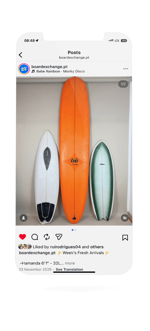
Board Exchange
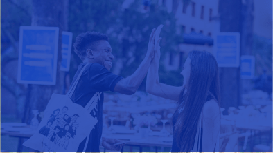
Board Exchange is a Portuguese brand dedicated to sell second-hand surf products. After its first growth phase, the founders felt the need to evolve the brand into something more mature, distinctive, and emotionally connected to surf culture. The goal was to create a new identity that communicates circularity, energy, and modernity, reinforcing the pride of giving surfboards a second life and choosing a more sustainable path within the surf world.
Expertise
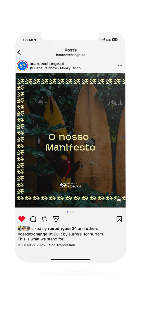
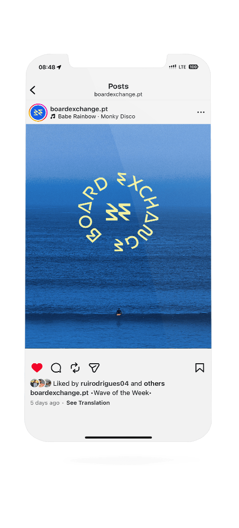
The project included the definition of brand concept, tone of voice and manifesto, the development of the visual identity, social media content and merchandising layouts, logo animation, as well as a full set of brand assets such as email signature, social media icons, patterns, mascot and brand book.
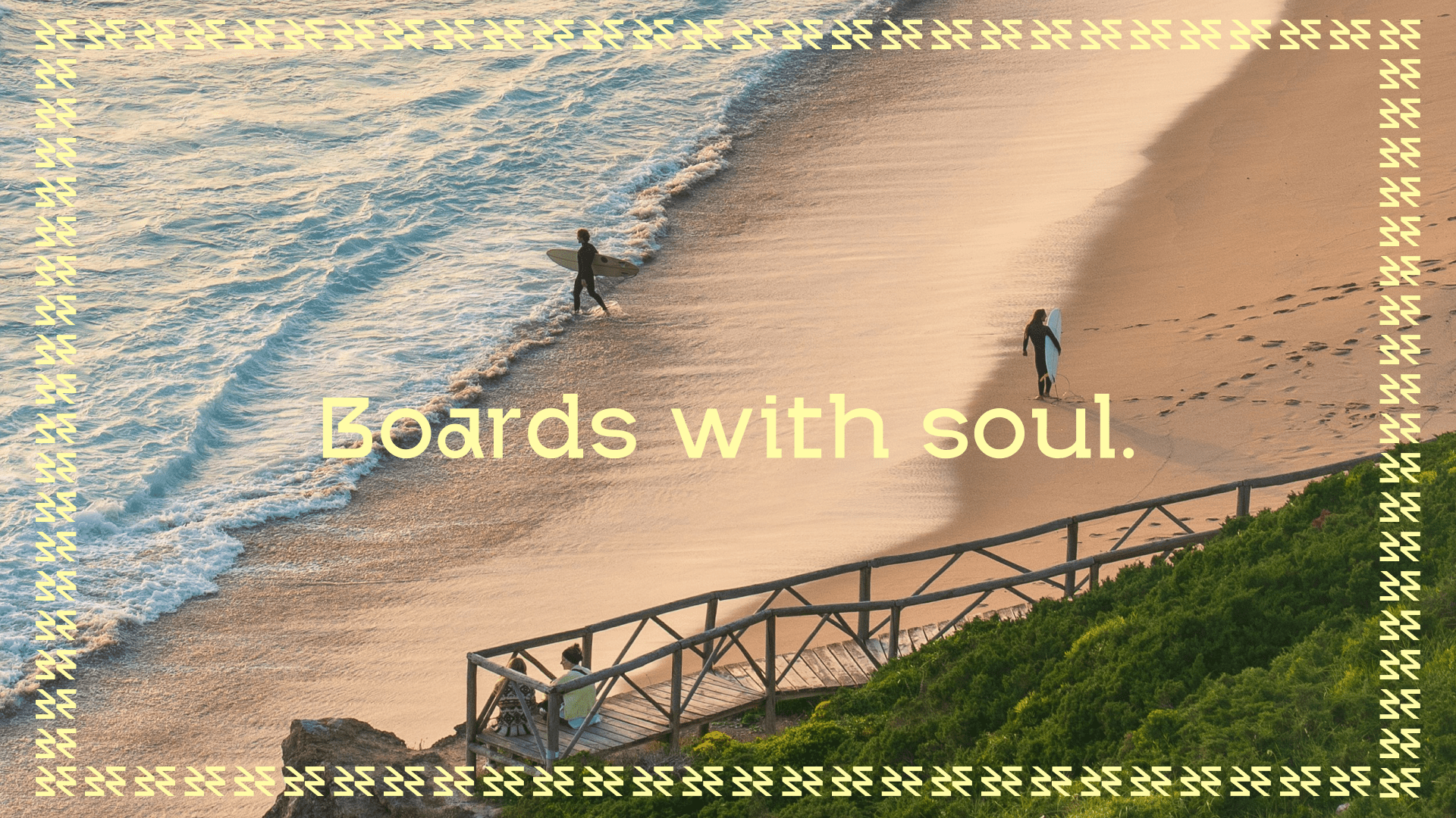
The Board Exchange logo was born from the fusion of the sea, energy, and continuous movement — the core essence of the brand.
Inspired by the initials B and E, the symbol was designed to represent the natural flow of waves and the cyclical rhythm of surfing.
The curved and directional shapes of the letters subtly incorporate the gesture of an arrow — a sense of forward movement and renewal that reinforces the idea of circularity, second life and waves.
The lightning bolt, integrated in an abstract way, represents the energy, innovation, and drive that keep Board Exchange moving forward — fast, digital, and connected to its community.
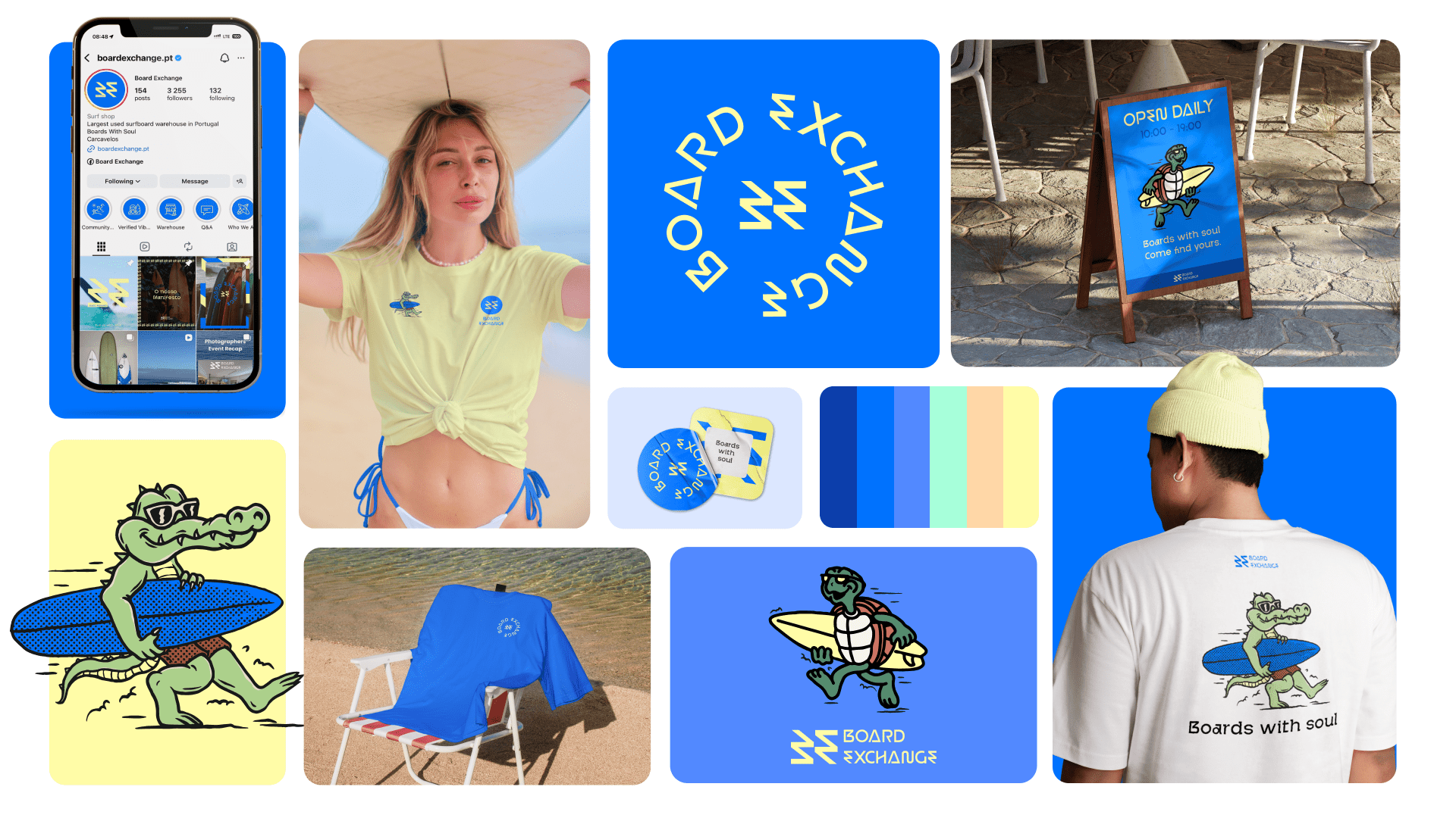
The identity is built around the typeface DH Ranclo, a bold and contemporary font that combines geometric precision with fluid curves. It brings a strong digital presence while subtly echoing the movement of waves and the energy of surf culture.
The color palette is inspired by the ocean and coastal landscapes. A vibrant blue leads the system, representing trust, depth and technology, supported by other shades of blue to create hierarchy and consistency. Accent colors introduce warmth and contrast: yellow for sunlight and energy, green for nature and freshness, and orange for sand, sunsets and heat.
Together, type and color express a brand that is modern, energetic and deeply connected to the sea.
Board Exchange
Working with João and Manuel on Board Exchange felt less like working for a brand and more like being part of it. Building this identity, shaping its voice and translating its spirit into a visual system was an incredibly rewarding experience and, without a doubt, one of the coolest branding projects to work on.
Services
Sourri – Dra. Rita Cotrim
Leap Forward