Sourri
In this project, I had the privilege of being chosen by Rita to help develop her personal brand identity. From the very beginning, Rita gave me complete creative freedom, without setting boundaries or rigid guidelines, which allowed the process to flow in a very natural and intuitive way.The main challenge was to translate Rita not just as a professional, but as a person — her values, her sensitivity, her way of caring and connecting with people — into a strong and coherent personal brand.
Expertise
The project included the definition of the brand concept, tone of voice and manifesto, the development of the visual identity, social media content, logo animation, and professional video and photography production.
The process began with in-depth research and a strategic questionnaire that helped define the brand’s core values: empathy, proximity, innovation and simplicity. From there, I explored how a dental brand could feel less clinical and more human — emotionally driven rather than procedure-focused.
The name Sourri became the foundation of the concept, blending:
-
“Sou” — the human side of the brand
-
“Rir” — joy and confidence
-
“Ri” — a subtle personal connection to Rita
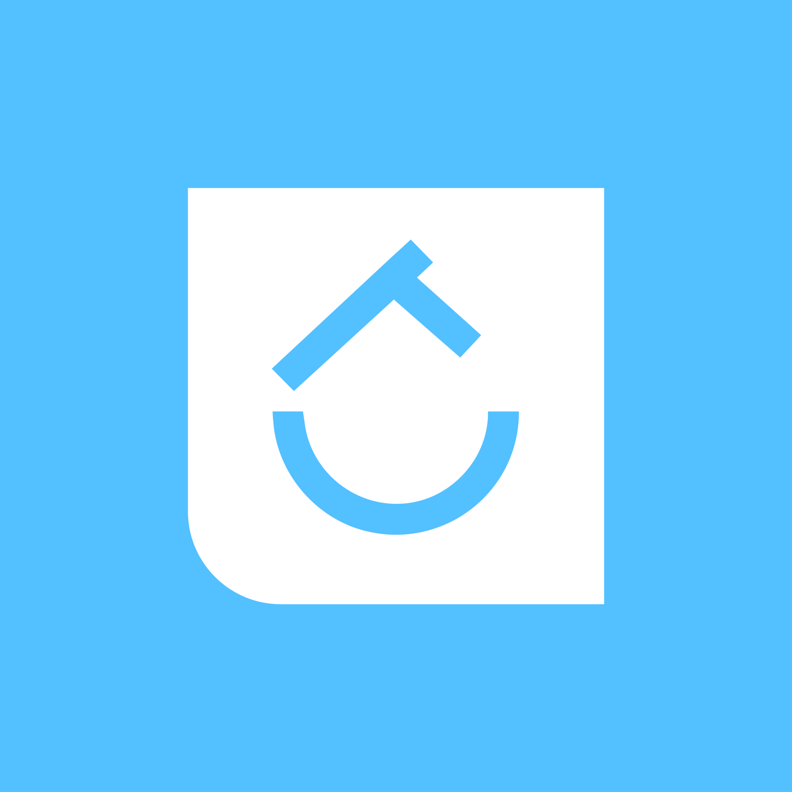
Visually, the identity was designed to be minimal yet meaningful. The symbol merges the initials R and C into a shape that simultaneously suggests a smile and a house — reinforcing the idea of care, belonging and safety.


The identity is built around the typeface DH Ranclo, a bold and contemporary font that combines geometric precision with fluid curves. It brings a strong digital presence while subtly echoing the movement of waves and the energy of surf culture.
The color palette is inspired by the ocean and coastal landscapes. A vibrant blue leads the system, representing trust, depth and technology, supported by other shades of blue to create hierarchy and consistency. Accent colors introduce warmth and contrast: yellow for sunlight and energy, green for nature and freshness, and orange for sand, sunsets and heat.
Together, type and color express a brand that is modern, energetic and deeply connected to the sea.


Beyond the visual identity, the collaboration with Rita continued through the development of ongoing content for her social media platforms. The goal was to translate the brand’s values into clear, human and educational communication.
We created posts that explain the brand concept and the manifesto behind it, alongside video content that reveals the reality behind the treatments — from how a surgical day unfolds, to how Rita prepares herself, how an evaluation appointment works, and what patients can truly expect from the process.


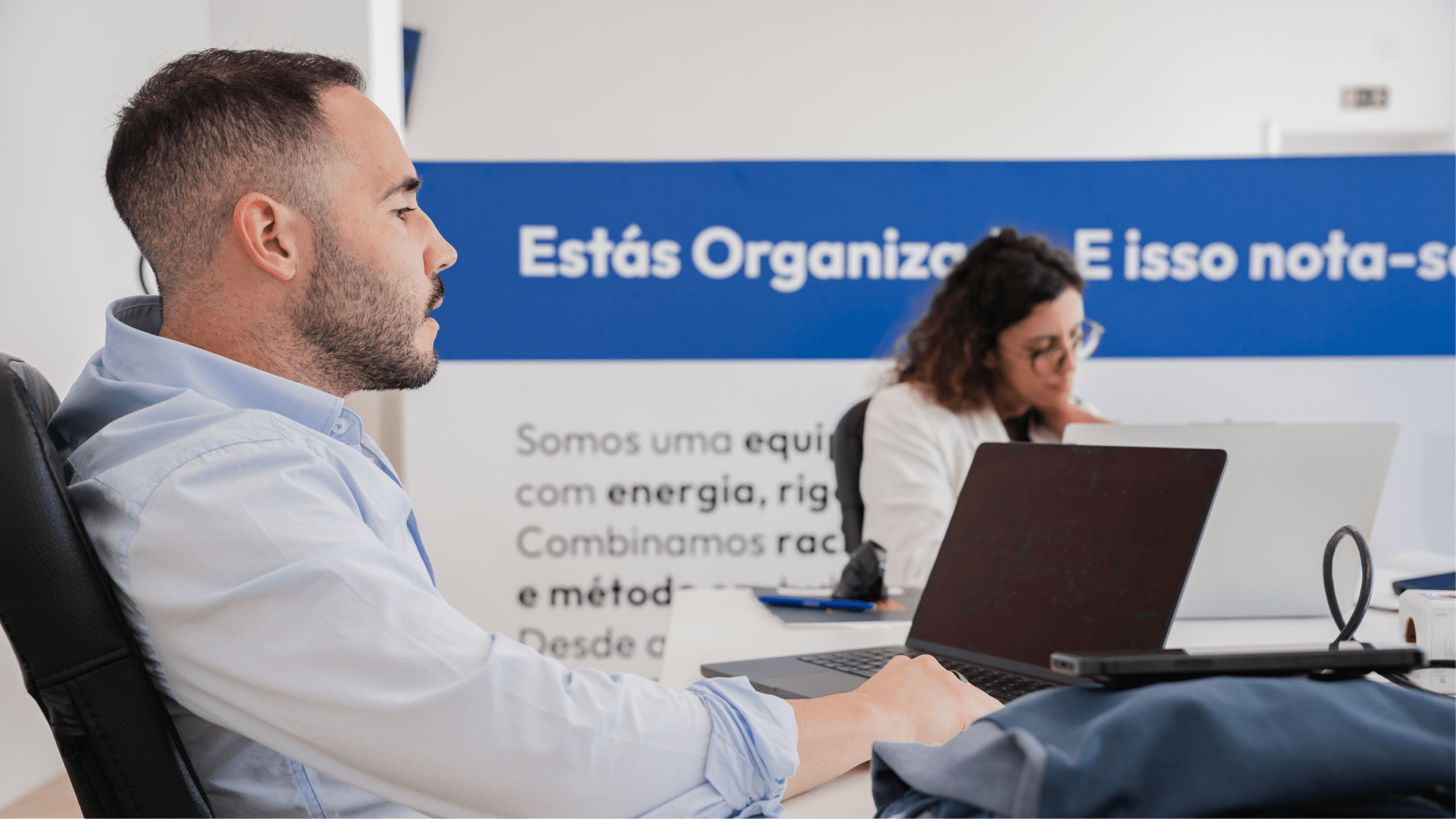
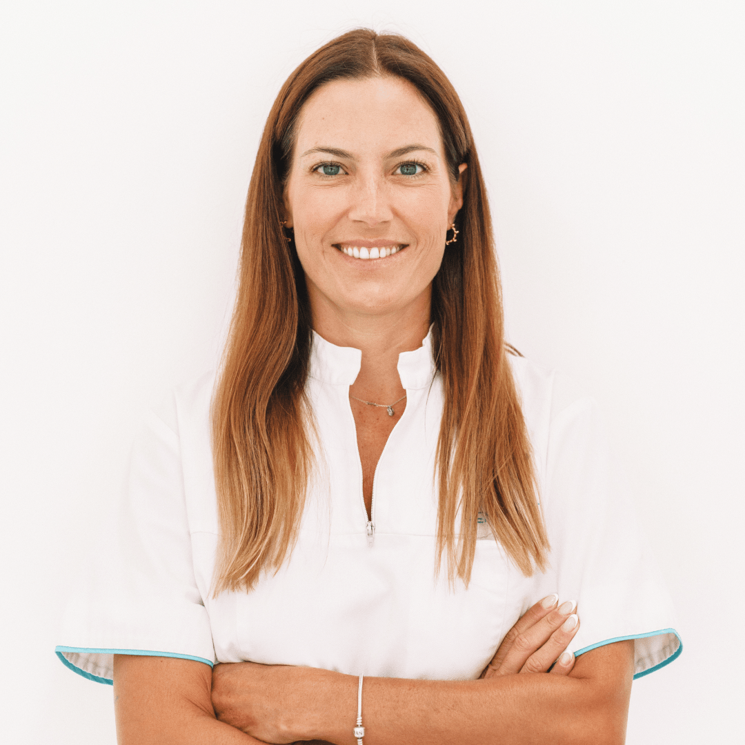
In parallel, we carried out several on-the-job photo sessions, capturing Rita in her natural working environment. These sessions were designed to build an authentic and versatile visual library that could support the brand over time.
By the end of the process, Rita had a personal image bank of over 500 photographs, giving her the freedom to communicate consistently across digital platforms, while always maintaining a genuine and human visual language.
Sourri
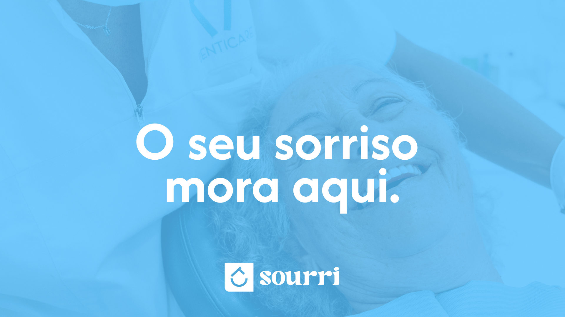
This project was a truly rewarding collaboration. Working closely with Dr. Rita Cotrim allowed the brand to grow through open dialogue, trust and a shared vision of what healthcare communication can be. Sourri is a place where technology meets empathy, and where every smile finds its home.
Services